Most of Genesis Child themes includes dashicons or ionicons icon in the responsive menu. Generally, It contains a simple toggle icon with no effect.
This tutorial provides the steps to add Animated Hamburger Menu Icon with x(close) smoothly animated effect in Genesis using Tasty CSS-animated hamburgers by Jonathan Suh.
Here are the types of animated hamburger icon effect. Check the live demo.
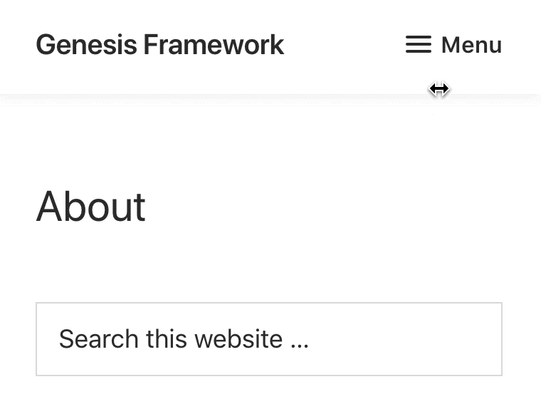
Tested on Genesis Sample 2.6.0
Prerequisite:
Open the live demo page of Hamburger menus and find your favorite one. Now, Right-click on that Hamburger menu and Click Inspect Element.

Here, I have clicked on Squeeze effect and here we need to see the common HTML elements.
<div class="hamburger hamburger--squeeze js-hamburger is-active">
        <div class="hamburger-box">
          <div class="hamburger-inner">
::before
::after
         </div>
        </div>
</div>
Now, Take a look at the Genesis Menu and here some HTML and CSS changes we need to make.
1. “is-active” will be replaced with “activated” as it is default in Genesis Menus. So, we will change HTML and CSS class name.
2. We will need to remove the dashicons CSS or similar class which add the content value of the icon.
.dashicons-menu:before {
    content: "\f333";
}
.menu-toggle.activated::before {
    content: "\f335";
}
Remember: All the CSS will go under the max-width media queries for the mobile screen. It may be
@media only screen and (max-width: 1023px) {
//Remove this line and paste the CSS
}
I am using Genesis Sample so I will use
@media only screen and (max-width: 959px) {

}
We will also add optional label CSS for showing the Text MENU after hamburger Icon.
.hamburger-label {
    font-weight: 600;
    display: inline-block;
    margin-left: 5px;
    vertical-align: middle;
    text-transform: uppercase;
}
Let’s see How we can do it.
STEP 1
Go to the hamburgers.css file. The first thing we need to grab the basic hamburger CSS. Here what we have by default. We will make some minor Changes in this.
/*!
 * Hamburgers
 * @description Tasty CSS-animated hamburgers
 * @author Jonathan Suh @jonsuh
 * @site https://jonsuh.com/hamburgers
 * @link https://github.com/jonsuh/hamburgers
 */
.hamburger {
  padding: 15px 15px;
  display: inline-block;
  cursor: pointer;
  transition-property: opacity, filter;
  transition-duration: 0.15s;
  transition-timing-function: linear;
  font: inherit;
  color: inherit;
  text-transform: none;
  background-color: transparent;
  border: 0;
  margin: 0;
  overflow: visible; }
  .hamburger:hover {
    opacity: 0.7; }
  .hamburger.is-active:hover {
    opacity: 0.7; }
  .hamburger.is-active .hamburger-inner,
  .hamburger.is-active .hamburger-inner::before,
  .hamburger.is-active .hamburger-inner::after {
    background-color: #000; }

.hamburger-box {
  width: 40px;
  height: 24px;
  display: inline-block;
  position: relative; }

.hamburger-inner {
  display: block;
  top: 50%;
  margin-top: -2px; }
  .hamburger-inner, .hamburger-inner::before, .hamburger-inner::after {
    width: 40px;
    height: 4px;
    background-color: #000;
    border-radius: 4px;
    position: absolute;
    transition-property: transform;
    transition-duration: 0.15s;
    transition-timing-function: ease; }
  .hamburger-inner::before, .hamburger-inner::after {
    content: "";
    display: block; }
  .hamburger-inner::before {
    top: -10px; }
  .hamburger-inner::after {
    bottom: -10px; }
STEP 2
Copy the Effect CSS using find tool (Cmd + F / Ctrl + F) and search for “Squeeze”. I have CSS for Squeeze effect. Replace the class name from > “is-active” to “activated”
/*
   * Squeeze
   */
.hamburger--squeeze .hamburger-inner {
  transition-duration: 0.075s;
  transition-timing-function: cubic-bezier(0.55, 0.055, 0.675, 0.19); }
  .hamburger--squeeze .hamburger-inner::before {
    transition: top 0.075s 0.12s ease, opacity 0.075s ease; }
  .hamburger--squeeze .hamburger-inner::after {
    transition: bottom 0.075s 0.12s ease, transform 0.075s cubic-bezier(0.55, 0.055, 0.675, 0.19); }

.hamburger--squeeze.is-active .hamburger-inner {
  transform: rotate(45deg);
  transition-delay: 0.12s;
  transition-timing-function: cubic-bezier(0.215, 0.61, 0.355, 1); }
  .hamburger--squeeze.is-active .hamburger-inner::before {
    top: 0;
    opacity: 0;
    transition: top 0.075s ease, opacity 0.075s 0.12s ease; }
  .hamburger--squeeze.is-active .hamburger-inner::after {
    bottom: 0;
    transform: rotate(-90deg);
    transition: bottom 0.075s ease, transform 0.075s 0.12s cubic-bezier(0.215, 0.61, 0.355, 1); }
STEP 3
This is the modified CSS of STEP 1 AND STEP 2, Contains a) Basic CSS b) Label CSS and c) Squeeze effect CSS for media screen max-width 959px.
@media only screen and (max-width: 959px) {

.site-header .menu-toggle::before {
	display: none;
}
.menu-toggle {
	margin-right: -5px !important;
}
/*!
* Hamburgers
* @description Tasty CSS-animated hamburgers
* @author Jonathan Suh @jonsuh
* @site https://jonsuh.com/hamburgers
* @link https://github.com/jonsuh/hamburgers
*/
.hamburger {
	padding: 10px 5px;
	display: inline-block;
	cursor: pointer;
	transition-property: opacity, filter;
	transition-duration: 0.15s;
	transition-timing-function: linear;
	font: inherit;
	color: inherit;
	text-transform: none;
	background-color: transparent;
	border: 0;
	margin: 0;
	overflow: visible;
	margin: 9px 0;
	color: #333;
	}
	.hamburger:hover {
	opacity: 0.9;
	}
	.hamburger.is-active:hover {
	opacity: 0.7; }
	.hamburger.is-active .hamburger-inner,
	.hamburger.is-active .hamburger-inner::before,
	.hamburger.is-active .hamburger-inner::after {
	background-color: #333; }

.hamburger-box {
	width: 19px;
	height: 9px;
	display: inline-block;
	position: relative;
	}

.hamburger-inner {
	display: block;
	top: 50%;
	margin-top: -2px;
	}
	.hamburger-inner, .hamburger-inner::before, .hamburger-inner::after {
	width: 18px;
	height: 2px;
	background-color: #333;
	/* border-radius: 4px; */
	position: absolute;
	transition-property: transform;
	transition-duration: 0.15s;
	transition-timing-function: ease;
	}
	.hamburger-inner::before, .hamburger-inner::after {
	content: "";
	display: block; }
	.hamburger-inner::before {
	top: -5px;
	}
	.hamburger-inner::after {
	bottom: -5px; }

.hamburger-label {
	font-weight: 600;
	font-size: 16px;
	font-size: 1.6rem;
	display: inline-block;
	margin-left: 6px;
	vertical-align: middle;
	color: #333;
	line-height: 1;
}

/*
 * Squeeze
 */
.hamburger--squeeze .hamburger-inner {
	transition-duration: 0.075s;
	transition-timing-function: cubic-bezier(0.55, 0.055, 0.675, 0.19); }
	.hamburger--squeeze .hamburger-inner::before {
	transition: top 0.075s 0.12s ease, opacity 0.075s ease; }
	.hamburger--squeeze .hamburger-inner::after {
	transition: bottom 0.075s 0.12s ease, transform 0.075s cubic-bezier(0.55, 0.055, 0.675, 0.19); }

.hamburger--squeeze.activated .hamburger-inner {
	transform: rotate(45deg);
	transition-delay: 0.12s;
	transition-timing-function: cubic-bezier(0.215, 0.61, 0.355, 1); }
	.hamburger--squeeze.activated .hamburger-inner::before {
	top: 0;
	opacity: 0;
	transition: top 0.075s ease, opacity 0.075s 0.12s ease; }
	.hamburger--squeeze.activated .hamburger-inner::after {
	bottom: 0;
	transform: rotate(-90deg);
	transition: bottom 0.075s ease, transform 0.075s 0.12s cubic-bezier(0.215, 0.61, 0.355, 1); }


}
I have simply added a display none css for menu-toggle::before as we are not using font icon.
STEP 4
Now, we are going to set up the markup in the responsive menu settings.
A) Open functions.php of your child theme and find similar code.
/**
 * Defines responsive menu settings.
 *
 * @since 2.3.0
 */
function genesis_sample_responsive_menu_settings() {

	$settings = array(
		'mainMenu'         => __( 'Menu', 'genesis-sample' ),
		'menuIconClass'    => 'dashicons-before dashicons-menu',
		'subMenu'          => __( 'Submenu', 'genesis-sample' ),
		'subMenuIconClass' => 'dashicons-before dashicons-arrow-down-alt2',
		'menuClasses'      => array(
			'combine' => array(
				'.nav-primary',
			),
			'others'  => array(),
		),
	);

	return $settings;

}
TYPE 1. To display just the hamburger menu icon without the Menu text, replace
'mainMenu' => __( 'Menu', 'genesis-sample' ),
with
'mainMenu' => '<span class="hamburger-box"><span class="hamburger-inner"></span></span>',
TYPE 2. To display the hamburger menu icon with the Menu text to its right, replace
'mainMenu' => __( 'Menu', 'genesis-sample' ),
with
'mainMenu' => sprintf( '<span class="hamburger-box"><span class="hamburger-inner"></span></span><span class="hamburger-label">%s</span>', __( 'Menu', 'genesis-sample' ) ),
B) Replace
'menuIconClass' => 'dashicons-before dashicons-menu',
with
'menuIconClass' => 'hamburger hamburger--squeeze',
STEP 5 (Optional)
To change the icon effect.
1. Go to the CSS page and copy the effect as mentioned in STEP 2, Combine it with step 1 from CSS Code mentioned in STEP 3.
2. Replace STEP 4. B) from > “hamburger–squeeze” to CSS name of the effect.
You are such a life saver. Thank you very much!
Hello.
He’s a great trainer. Currently my version of Genesis is 3.3.5, which implements all the functionality of the tutorial. I’m using Genesis Sample 3.4.1 but couldn’t get it to work.
Can you share the required piece of code for everything to work?
Thank you.
Please share the website url so i check and share the code.