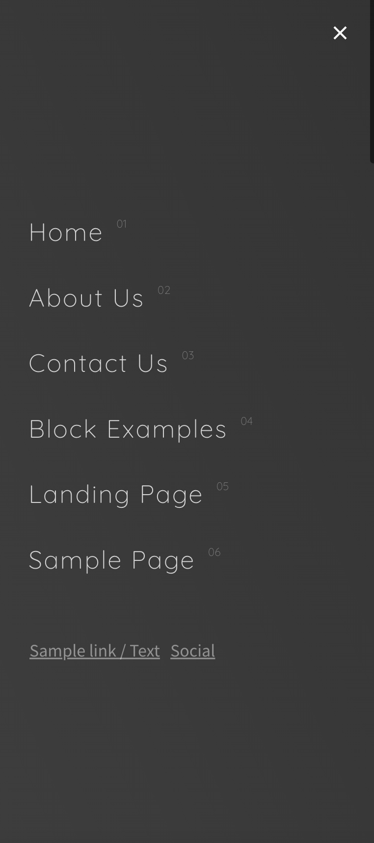
This tutorial provides the steps to create a responsive hamburger menu in any theme based on the Genesis framework. The tutorial will also work for non-genesis themes with minor changes.
Tested on Genesis Sample 3.4.1
Preview:
Prerequisite:
none.
STEP 1
The first step is to disable the default Genesis responsive menu. In child-theme/functions.php find and comment out the code.
// Registers the responsive menus.
//if ( function_exists( 'genesis_register_responsive_menus' ) ) {
//	genesis_register_responsive_menus( genesis_get_config( 'responsive-menus' ) );
//}
Result:- Toggle Menu will disappear, and the Menu will be visible for desktop only.
STEP 2
Register a new Nav Menu using the following code in child-theme/functions.php
// * Register a Menu
add_action( 'init', 'register_my_menu' );
function register_my_menu() {
	register_nav_menu('hamburger-menu',__( 'Burger Menu' ));
}
STEP 3
Position the Nav Menu in the site header with the help of Genesis Hooks using the following code in child-theme/functions.php
To view the full content, please sign up for the membership.
Already a member? Log in below or here.

